

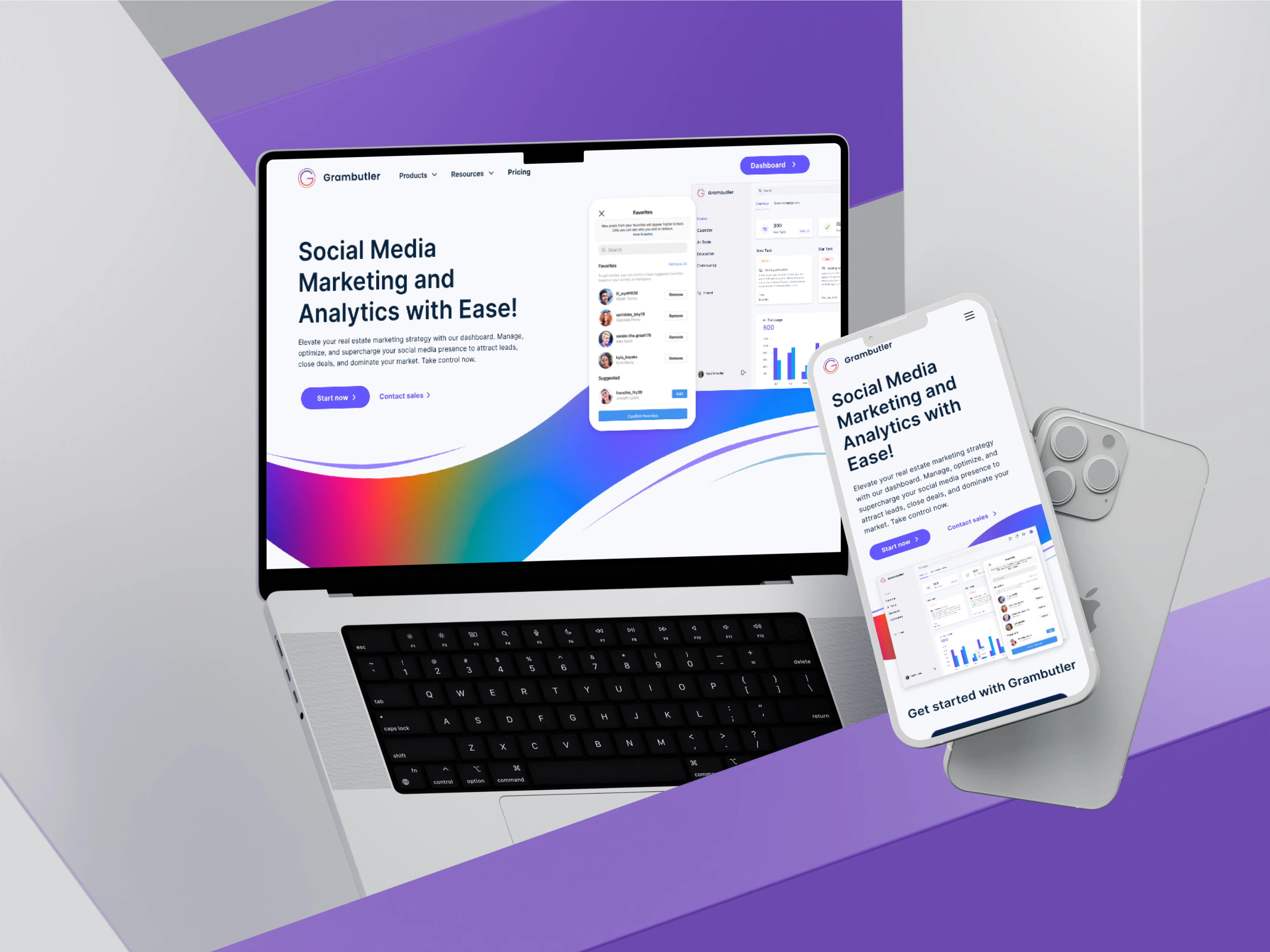
UI/UX Designer
Figma, Miro, Notion
SaaS
Web App
Most analytics platforms have a usability problem disguised as a data problem.
They surface enormous volumes of metrics without context, priority, or guidance. Users are expected to interpret dashboards, identify patterns, and decide what actions to take next. For large organizations with dedicated analysts, that may be manageable. For small businesses, growing marketing teams, and agencies managing multiple clients, it often is not.
The result is predictable. Businesses either pay for analytics they do not fully understand or make decisions based on instinct because the data feels overwhelming.
Grambutler was created to bridge that gap.
The challenge was not simply designing another analytics dashboard. The challenge was creating a platform that could serve three fundamentally different user groups while remaining clear, actionable, and approachable.
Before any feature could succeed, the platform needed to answer one question:
What should I do with my social media today?
Before the product could be useful, it had to be understandable to someone who was not a data analyst.
The design process ran across five structured stages, each building directly on what the previous stage uncovered.
I started by mapping the three distinct user types the platform needed to serve: the solo business owner who manages their own social presence with limited time, the in-house marketing manager who needs to report upward and act quickly, and the agency account manager who runs multiple client accounts simultaneously. Each persona had different literacy levels with data, different relationships with the platform, and different definitions of a successful session. I mapped their goals, frustrations, and decision-making flows before touching a single wireframe, because the information hierarchy decisions that followed depended entirely on understanding which user was looking at each screen and what they needed to be able to do in the next thirty seconds.
The most consequential structural decision was how to organise the dashboard when one user might care about engagement rates and another needs follower growth or competitor benchmarking. I mapped competing approaches: a single unified view with all metrics visible, a modular widget system, and a role-based view that changed based on account type. The modular widget approach won because it let the platform serve all three user types without forcing any of them through a cluttered default state. The information architecture was finalised before any visual design began.
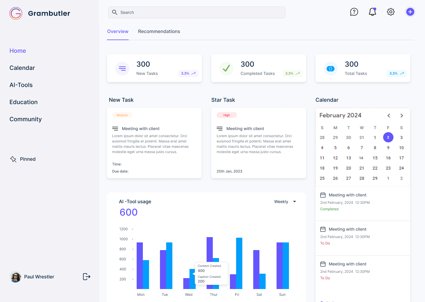
I built low-fidelity wireframes for every core screen: the unified dashboard, the AI insights panel, the content analysis view, the competitor benchmarking interface, and the multi-platform reporting flow. The dashboard layout was the hardest to resolve. My first two versions failed the same way: putting all available metrics on the primary view made the screen feel like a report rather than a tool. The third version imposed a strict hierarchy: primary health indicators at the top, AI recommendation of the day below that, and deeper analytics accessible through progressive disclosure. That structure held.
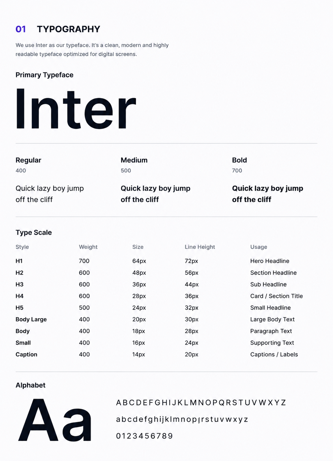
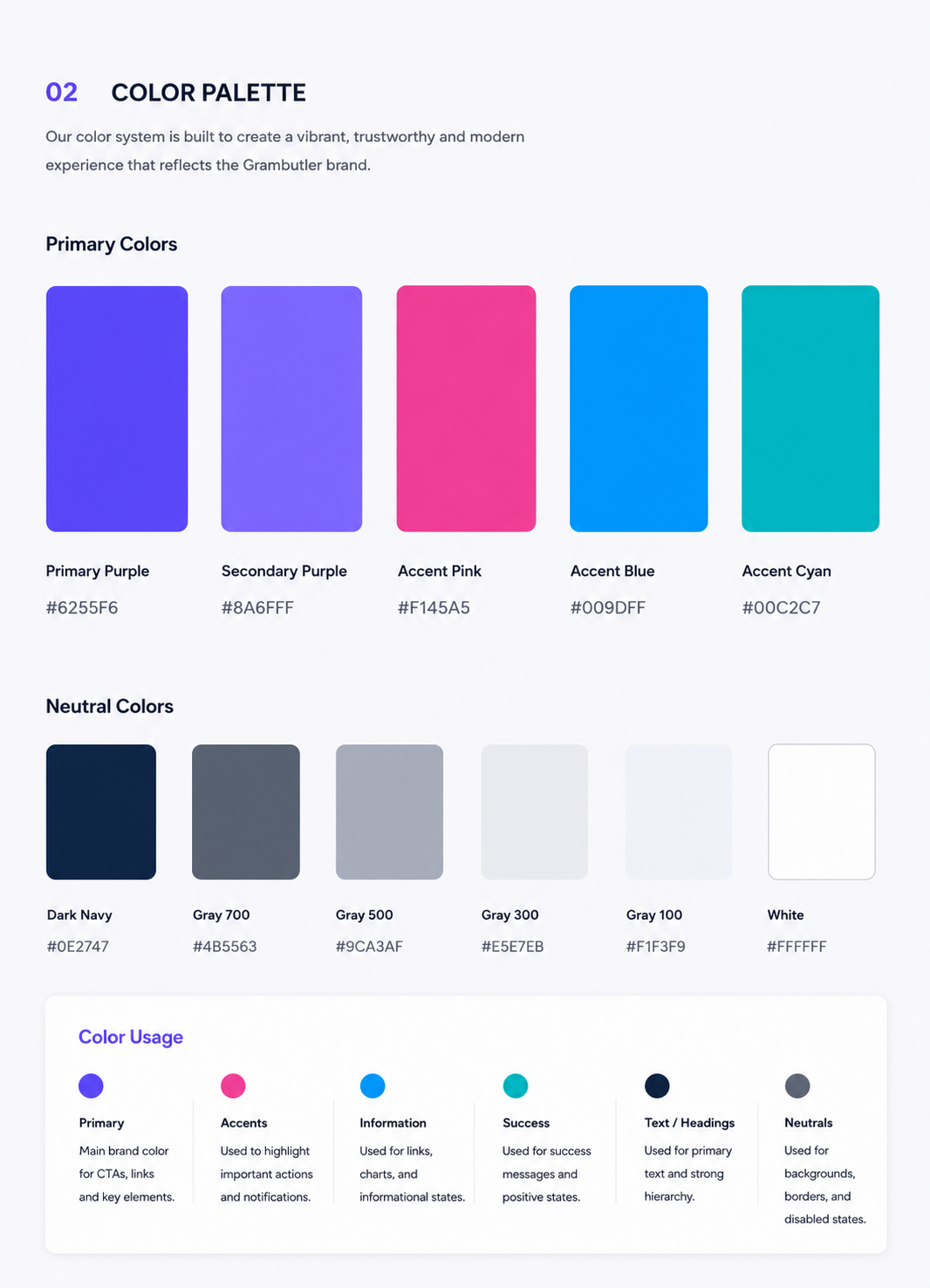
Before building high-fidelity screens, I established the visual language:
Typography scale, color system, data visualisation tokens, spacing rules, and component library.
The design system was especially important here because Grambutler surfaces data across six social platforms, each with distinct visual identities.
The system needed to unify all of that without looking generic. The dark mode was designed in parallel with the light mode, not retrofitted afterwards, because the platform is intended for extended daily use.
High-fidelity designs were built across all core screens and flows, then prototyped in Figma for stakeholder review. Handoff included annotated designs, component documentation, and interactive prototypes prepared for the development team with nothing left to interpretation.
The obvious implementation of an AI insights panel is a feed: every time the algorithm detects something, it fires a card. I built that version in wireframe and it immediately created a problem: a feed of insights has no hierarchy. Twenty recommendations carry the same visual weight as one, which means users learn to ignore them all. That is the same failure mode as the email inbox: everything urgent, so nothing is.
I redesigned the AI insights panel around a single daily recommendation surfaced prominently on the dashboard, with secondary insights accessible below it. The primary recommendation follows a specific format: one observation, one reason, one action. Not a data alert. A prompt that tells the user what to do and why.
An insights panel that users scroll past is not an insights panel. It is decorative data.
Grambutler runs across three pricing tiers. The design challenge was how to make tier restrictions visible without making lower-tier users feel like they are constantly looking through a locked window at features they cannot access. My first approach used greyed-out locked states with upgrade prompts throughout the interface. Testing that approach in prototype made clear that it created anxiety, not motivation: users on the Starter plan felt the product was incomplete rather than expandable.
I replaced the locked-state pattern with progressive disclosure. Lower tiers see a clean, complete interface for the features they have access to. Upgrade prompts appear contextually, only at the moment a user tries to do something that requires a higher tier, and they are framed around the specific capability rather than a generic upsell.
A product that makes users feel restricted will not retain them long enough to convert them.
The platform processes data across six social networks simultaneously. The first approach to the multi-platform view mapped all platform metrics into a comparative table. It was complete. It was also unreadable at a glance, which is the only glance most users will give it during a busy working day.
I rebuilt the multi-platform view around visual priority rather than data completeness. Each platform gets a performance indicator that communicates status before the user reads a single number: trending up, trending down, or requiring attention. The full data is available on click.
A user should be able to understand the health of all six platforms in under ten seconds without reading anything.
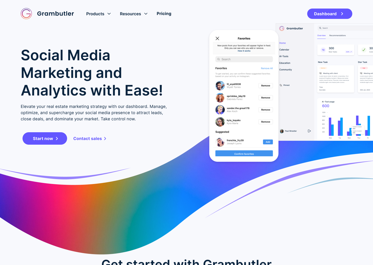
I delivered a complete high-fidelity UI across all core product flows: the unified analytics dashboard, the AI insights panel, the content performance view, the competitor benchmarking interface, the multi-platform comparison view, and the subscription management flow. Every screen was built to the same design system, established before the first high-fidelity screen was drawn. The prototypes covered all three user types across all three subscription tiers, with distinct flows validated for each.
What the platform now enables is a qualitative shift in who can use enterprise-grade social media analytics. A solo business owner can open the dashboard, read the AI recommendation of the day, and act on it without needing to understand what a conversion rate calculation means. A marketing manager can brief their director on cross-platform performance in three minutes. An agency can manage 25 client accounts from a single interface without switching tools. The design made all three of those things possible in the same product.
If I returned to this project, I would push for usability testing with actual solo business owners specifically on the AI insights panel before launch.
I validated the panel’s structure through stakeholder review and prototype walkthroughs, but the users most likely to benefit from it are also the least data-literate, and their mental model of what an AI recommendation should look and sound like is likely different from what a product team assumes. Testing that specific interaction with that specific user group would have either confirmed the approach or surfaced language and framing issues I could not have identified from inside the design process.
What this project sharpened in me was the discipline of designing for the person with the least context in the room, not the person with the most, because that is who most SaaS products actually lose
If I returned to this project, I would push for usability testing specifically on the two-sided onboarding flows: the moment where a new user self-selects as a job seeker or recruiter and enters their respective experience for the first time. Over 16 weeks I designed extensively for what happens after that decision, but I validated the onboarding sequence primarily through stakeholder review rather than with real users. The stakes at onboarding are high: a job seeker who misunderstands the CV builder in the first two minutes will not complete it, and a recruiter who can’t find their pipeline on day one will not return. Testing that critical first five minutes with both user types would have either confirmed the current approach or surfaced drop-off points I couldn’t have anticipated from the inside.
What this project built in me was a sharper instinct for two-sided product design: the discipline of asking, for every single screen, which user is looking at this and what do they need to be able to do next.
It does not need to be fully scoped. Tell me what you are working on and what you are trying to achieve, I will come back with an honest view of what is possible and how I would approach it.