

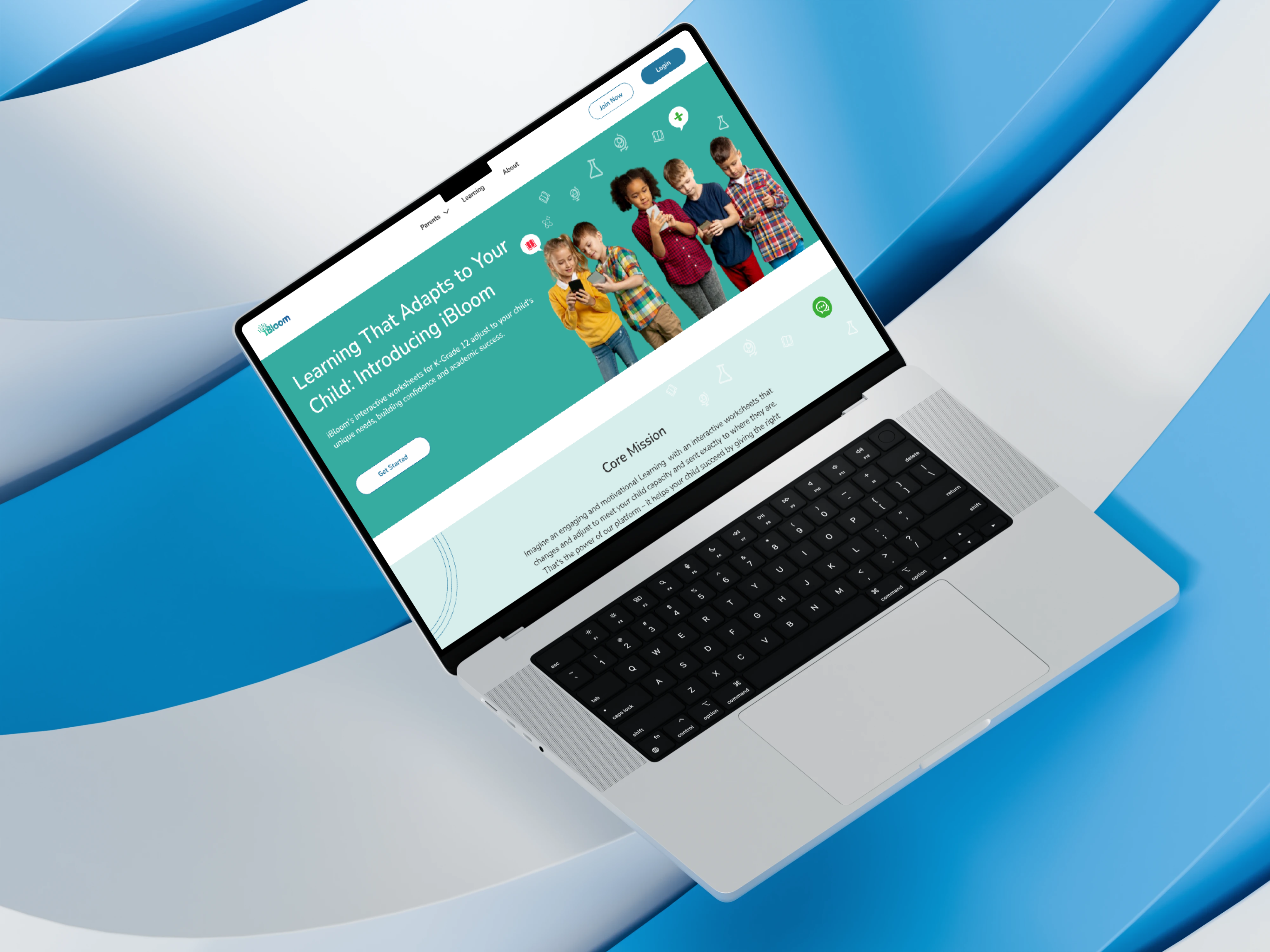
UI/UX Designer
Figma
EdTech
Responsive Web App
K-1 through K-12 educators were losing significant preparation time to curriculum and worksheet discovery. Finding grade-appropriate, standards-aligned materials meant searching across multiple platforms with no guarantee the results would fit a specific lesson. iBloom was built to solve that through AI-powered retrieval: a teacher enters a grade, subject, and topic, and the AI surfaces a matched curriculum outline with corresponding worksheets.
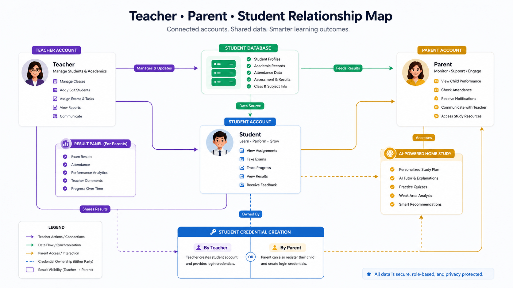
The design challenge was larger than a teacher tool. iBloom connected three interdependent user types. A teacher holds a student database and creates unique credentials for each student. A teacher can also link a parent to a child’s result panel, giving that parent visibility into school performance. A parent can go further and use the same AI independently to set up home study or supplementary sessions for their child. A student accesses the platform through credentials created by either a teacher or a parent, and the AI surfaces appropriate materials regardless of who set them up.
Before the interface could serve any one of these users well, it had to make the relationships between them feel logical rather than complicated.
I mapped each role’s primary job before designing anything. The teacher needed to retrieve curriculum and manage students from the same view. The parent needed to monitor school performance and independently run home study sessions, two entirely different tasks. The student needed to open the platform and find relevant materials immediately, regardless of who had created their account. Until those jobs were clearly separated, any interface I built would try to serve all three at once and serve none of them properly.
My first architecture gave all three roles access to one authenticated space, with visibility rules filtering content by role. The logic was clean. The result was not. A parent linked to a child’s result panel by a teacher, who also used the platform independently for home study, was navigating two completely different contexts with nothing separating them. I moved to role-specific dashboards accessed through a clear entry layer, so each user landed in a space built entirely for them.
Even within the parent flow, the shared dashboard failed. Performance data shared by a teacher and home study sessions the parent had set up independently sat side by side with no logic between them. I introduced two named modes within the parent session: Performance, populated by teacher-shared data, and Home Study, where the parent worked directly with the AI. A single clearly labelled toggle in the navigation let the parent switch between them. The parent always knew which context they were in and what they could do there.
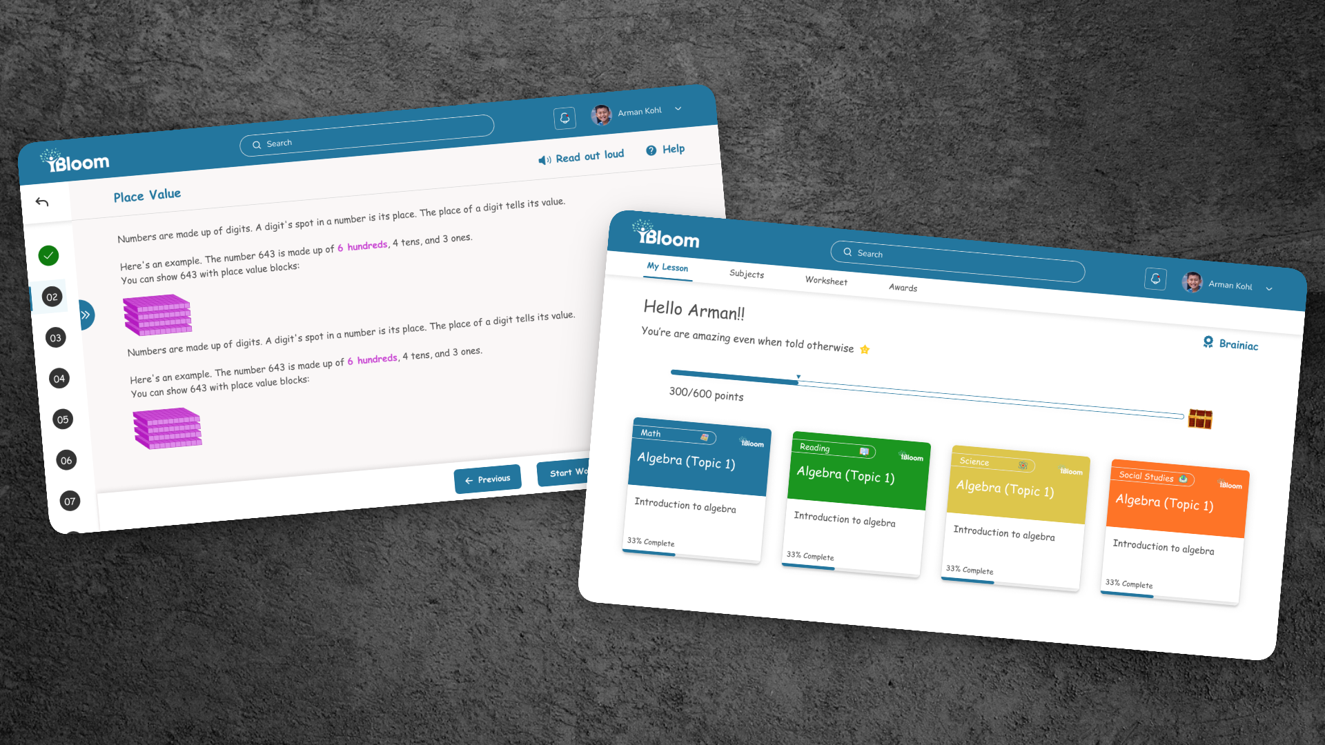
The initial student flow tried to reflect who had created the account, surfacing school curriculum for teacher-created accounts and home study materials for parent-created ones. The problem was that a child’s experience should not be shaped by an administrative decision they had no part in. I made the student dashboard entirely AI-driven, surfacing materials based on grade level and subject regardless of credential source. The AI was the constant. Who created the account was irrelevant to what the student saw.
My first design gave parents one dashboard where all available data appeared together. Performance data from the teacher sat alongside home study sessions the parent had set up, with no logic separating them. A parent checking school results and a parent setting up a study session are doing different things and need different tools in front of them. I introduced two named modes, Performance and Home Study, each opening a focused view with only the relevant data and controls.
A parent who cannot immediately tell what they are looking at will not trust a platform with their child’s education
The initial student flow made the student’s experience contingent on who had created their account, a decision the student had no knowledge of or involvement in. I designed the student dashboard to be entirely AI-driven, with materials surfaced based on grade level and subject. The student lands and finds what is relevant to them. The credential source stays in the teacher and parent layer where it belongs.
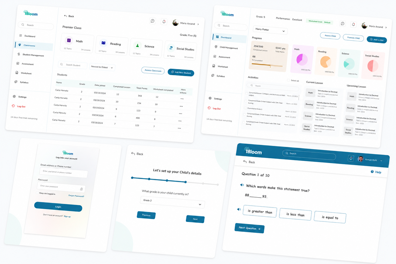
The first version separated student management into its own admin area away from curriculum retrieval. That forced the teacher to switch contexts to do related tasks. Adding a student, creating credentials, and linking a parent to a result panel all happen in the context of knowing a specific child. I brought the student database into the teacher’s main dashboard as a panel alongside curriculum retrieval. From one screen, a teacher could manage students and plan lessons without breaking their workflow.
I delivered the complete UI across all three user flows: teacher curriculum retrieval and student database view, the parent dual-mode performance and home study interface, and the student AI-driven materials dashboard. The student experience included a structured onboarding sequence on first login and a gamified learning environment where students earn trophies and rewards as they progress through materials, giving younger learners a reason to return and engage consistently. The Figma design system covered shared components across all three flows, with handoff including annotated screens, interaction notes, and responsive behaviour for desktop and tablet.
Every screen was held to the same standard: the right user should be able to complete their primary task on the first visit without reading any instructions. The AI carried the complexity. The design’s job was to make sure no user ever felt it.
It does not need to be fully scoped. Tell me what you are working on and what you are trying to achieve, I will come back with an honest view of what is possible and how I would approach it.