
UI/UX Designer
16 Weeks
HR Tech
Web App & Mobile App
Recruitment is broken in both directions at once. Job seekers submit applications that vanish: no feedback, no status, no signal that a human ever saw their CV. Their profiles look identical to hundreds of others because the tools available to them offer no way to stand out. On the other side, recruiters are spending hours manually sifting through applications from candidates who were never a realistic fit, sourced from a process that rewards volume over relevance. Neither party trusts the system. Both have adapted to expect the worst from it.
The design challenge was not simply to improve an existing experience. It was to build something that served two users with fundamentally opposing needs: the job seeker who wants visibility and clarity, and the recruiter who wants signal without noise, without making either feel like an afterthought in a product built primarily for the other.
Before this platform could work for either user, it had to be genuinely useful to both, and the design of every screen had to hold that tension without resolving it in one side’s favour.
I started by mapping both user journeys separately before attempting to connect them. For job seekers: what breaks down between the moment they decide to apply and the moment they hear back, or do not? For recruiters: what wastes time between posting a role and making a hire? The research produced a consistent finding across both sides. Job seekers had no reliable way to communicate fit. Recruiters had no reliable way to filter for it. The core design problem was not an interface problem. It was a signal problem. That framing shaped every structural decision that followed.
With the signal problem identified, I explored how to structure a two-sided platform without resolving it in one user’s favour. I mapped competing approaches: a single neutral view serving both users from the same screen, two entirely separate products sharing a data layer, and a unified platform with purpose-built experiences for each side. The third approach won because it allowed the design to serve each user’s actual mental model without forcing compromise on either. The decision not to merge the two views into one neutral interface was the most consequential structural choice of the project.
I defined the product’s information architecture: the core user flows for both job seekers and recruiters, how the two sides connect at the matching and application layer, and what the MVP feature set needed to be to solve the signal problem without overwhelming either user. This stage produced the IA documents and flow maps that every subsequent design decision referenced.
I built low-fidelity wireframes for all core screens across both user experiences: the job seeker profile and CV builder, the AI matching interface, the application tracking pipeline, the recruiter dashboard, and the talent discovery view. Wireframes were validated with stakeholder feedback before moving forward. The application tracking feature went through three structural versions. The first mirrored the recruiter’s pipeline logic and showed it directly to the job seeker. That version failed because job seekers do not think in pipeline stages. They think in questions: did anyone read this, am I still being considered? The third version was rebuilt around those questions, and the clarity difference was immediate.
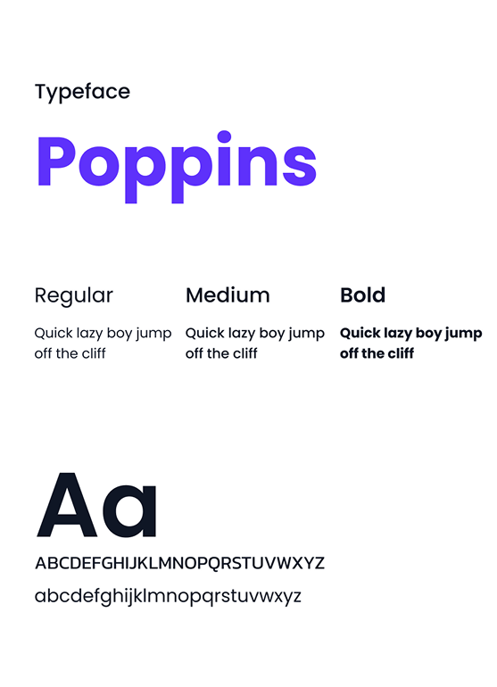
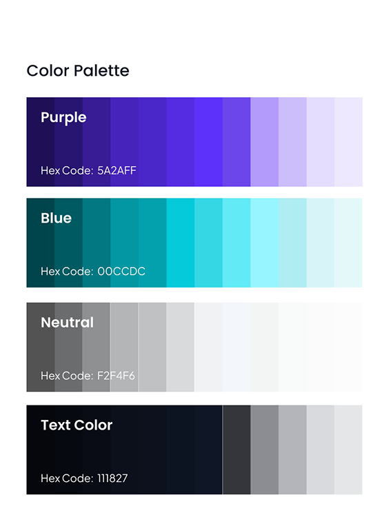
Before building high-fidelity screens, I established the visual language: typography system, colour palette, component library, and spacing rules. The design system needed to work across both a web app and a mobile app without losing consistency, and it needed to feel professional enough for enterprise recruiter users while remaining approachable for job seekers who may be anxious about the process. Both constraints shaped the system.
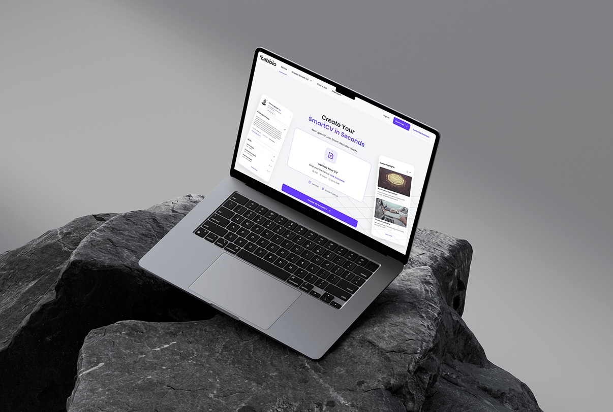
High-fidelity design was built across all screens for both user experiences: the job seeker flow, the recruiter dashboard, the CV builder, the job matching interface, and the application tracker. Every screen was built to the same design system established in the style guide stage.
Annotated designs, component documentation, and interactive prototypes were prepared for the development team. Clean, complete, with nothing left to interpretation.
My initial wireframe for the CV builder was a multi-section form: personal details, work history, education, skills. It was accurate to what a CV needs to contain. It was also the exact experience job seekers already found tedious and abandoned. A long form front-loads effort and gives no feedback until the end, the user has no sense of how their output is shaping up, and no motivation to keep going.
I redesigned the CV builder as a step-by-step guided flow with a real-time preview updating alongside each input. The user fills in one section, sees the CV update immediately, and moves forward with visible evidence that progress is happening. The psychological shift is from “I am completing a form” to “I am watching my CV take shape.”
A CV builder that users abandon halfway through is worse than no CV builder at all, a half-built CV cannot be matched to any role.
Job seekers apply for roles they are not suited for. Recruiters receive hundreds of applications from those same candidates. The standard fix is to show a match score, a percentage that signals fit. I designed that first. The problem was immediate: a percentage feels arbitrary. A 71% match invites the user to question what the missing 29% is rather than act on what the number is telling them. It creates doubt instead of direction.
I replaced the percentage with a visual match indicator, a signal that communicates fit quality intuitively without requiring the user to interrogate the calculation behind it. The visual challenge was showing match quality clearly without overwhelming either side with data.
If users don’t trust the match signal, they bypass it entirely, and the platform reverts to the same volume-based, manual screening it was built to eliminate.
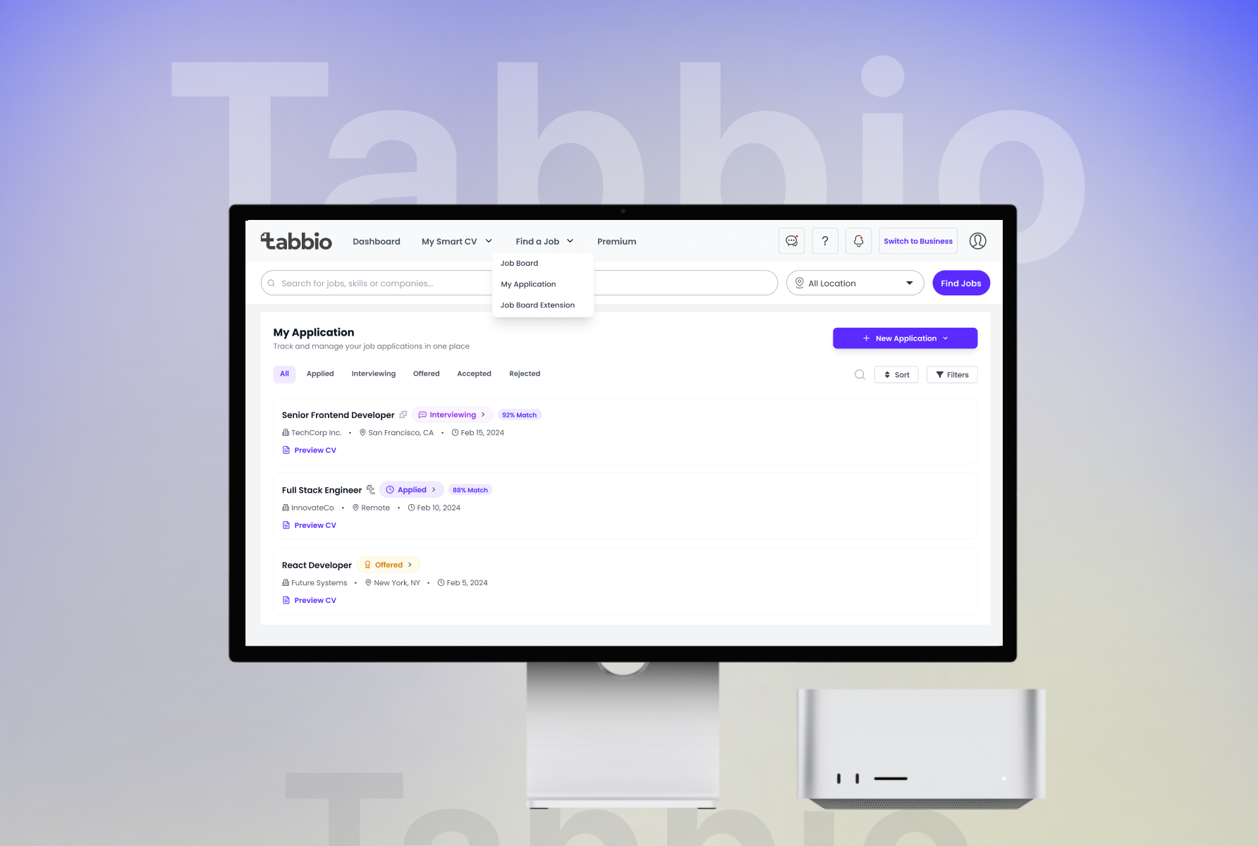
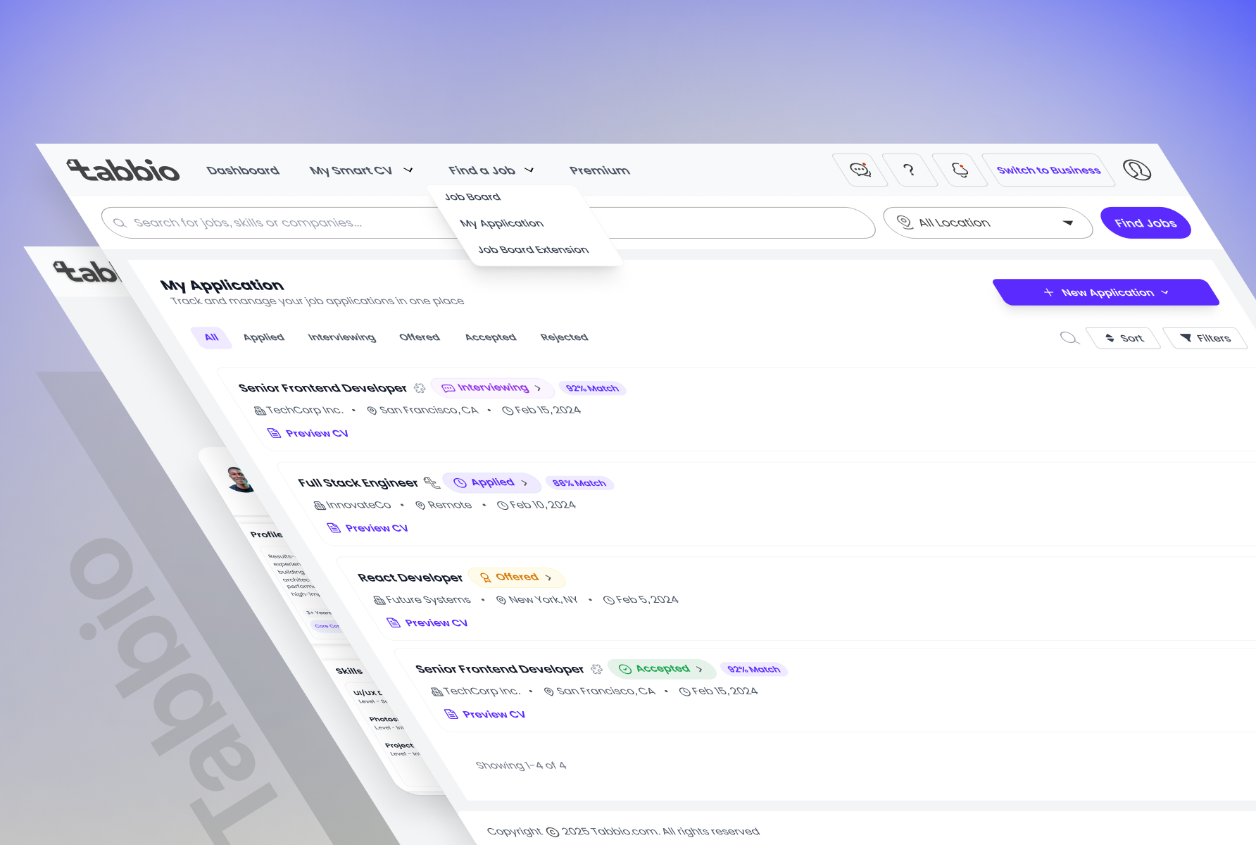
Job seekers apply and then hear nothing. The process feels like a black box, and for most platforms it is. My first design for the application tracker pulled the recruiter’s internal pipeline stages and displayed them directly to the job seeker. It was technically accurate but immediately wrong in practice. A job seeker does not think in pipeline terminology. They think: was this read? Am I still in the running?
I redesigned the tracker as a transparent application pipeline that shows the job seeker exactly where their application sits at every stage: submitted, under review, shortlisted, rejected. All written in plain language rather than internal status codes. The structure is modelled on the clarity of a kanban board but simplified for a non-technical user.
“Your application is being reviewed” is a human statement. “Status: Stage 2” is not. One builds trust with the platform. The other erodes it.
Recruiters manage dozens of open roles and hundreds of candidates across disconnected tools simultaneously. My first dashboard layout treated all candidate information with roughly equal visual weight: role, application date, skills, match indicator, and summary all competing for attention on the same card. In practice, recruiters spent time reading rather than deciding. The layout was treating initial triage, a two-second keep-or-pass call, as if it required the same attention as a full evaluation. It does not.
I redesigned the dashboard so the most urgent items surface first without the recruiter having to hunt: match quality at the top of the visual hierarchy, application stage next, key differentiators below, full profile available on click. The information architecture prioritises the signal over the noise, because recruiters spend seconds per candidate in initial review, not minutes.
A dashboard that slows down triage cancels out the platform’s core value before the recruiter gets anywhere near a shortlist.
Finding the right candidate in a pile of applications is manual, slow, and by default biased toward whoever applied earliest. Most recruitment tools order applications by submission date because it is the easiest implementation, not because it helps anyone hire better. I designed the first version of the talent discovery interface that way. It immediately reproduced the exact problem the platform was built to solve.
I redesigned talent discovery to surface candidates ranked by fit rather than recency, candidates the recruiter may not have considered yet, ordered by how well they match the role. Each candidate card shows just enough information to evaluate and act: match quality, key skills, a one-line summary. Full profile on click. The visual design makes it easy to move quickly through candidates without losing the depth available when a recruiter wants to go further.
A list ordered by timestamp is not a shortlist. It is an inbox. The recruiter needed a shortlist.
I delivered a complete high-fidelity UI across both the job seeker and recruiter experiences: the guided CV builder, the AI job matching interface, the application tracking pipeline, the recruiter dashboard, and the talent discovery view. All built to the same design system established before the first high-fidelity screen was drawn. The handoff package included annotated designs, component documentation, and interactive prototypes prepared for the development team, with nothing left to interpretation. Sixteen weeks from research to handoff, covering seven stages of process, with full ownership across every one of them.
What the platform enables is a qualitative shift on both sides of the hiring process. Job seekers can present themselves with structure and context rather than a static document that looks like everyone else’s. Recruiters can get to the right candidate without wading through the wrong ones first. The design made it possible for both to be true in the same product.
If I revisited the project, I would conduct usability testing focused specifically on onboarding. The platform successfully solves problems after users enter the system, but onboarding is where adoption is won or lost. Testing those first five minutes with both job seekers and recruiters would help validate assumptions and uncover friction before scale.
If I returned to this project, I would push for usability testing specifically on the two-sided onboarding flows: the moment where a new user self-selects as a job seeker or recruiter and enters their respective experience for the first time. Over 16 weeks I designed extensively for what happens after that decision, but I validated the onboarding sequence primarily through stakeholder review rather than with real users. The stakes at onboarding are high: a job seeker who misunderstands the CV builder in the first two minutes will not complete it, and a recruiter who can’t find their pipeline on day one will not return. Testing that critical first five minutes with both user types would have either confirmed the current approach or surfaced drop-off points I couldn’t have anticipated from the inside.
What this project built in me was a sharper instinct for two-sided product design: the discipline of asking, for every single screen, which user is looking at this and what do they need to be able to do next.
It does not need to be fully scoped. Tell me what you are working on and what you are trying to achieve, I will come back with an honest view of what is possible and how I would approach it.